I create high-end digital products combining smart concepts and beautiful designs with the best technology practices.
In 2017 I decided to be available as a freelancer in London to experience different environements and to expand my field of competences. At the same time that I've founded Where the Road-Ends, a company to put on trial my experiments and to connect the most talented professionals together, to build cutting-edges products.
Before that, I was an Art Director at Random Studio (Amsterdam), where I've started to get my hands on Digital Installations. I had the chance to be on stage with the rest of the team at Resonate 2016 in Belgrade.
It was in 2013 that I've moved to London to work for Hi-ReS! where my role was to concept creative solutions for innovative experiences. It’s also the place where I've learned how to code rich experiences in webGL and co-produced V O iD, VOID-Pandora. We had the opportunity to show these projects on stage for the Awwwards conference 2015 in Amsterdam "Make the Internet great again".
Prior to my experience in London, I've worked at Werkstatt and 03July in Paris for two years. During this period, I've focussed a lot on finding fine concepts for luxuary brands such as Dior and Kenzo. It was also the time to build my first Apps and discover the beauty of the more experimental websites.
Back in Lyon(FR), I've spent 7 years studying Art Direction, Visual Design and Technology at the Schools of Bellecour and Condé.
kevin. introduces a fresh payment solution to the market. We've meticulously crafted the digital representation of their brand and developed their website.
A WebGL experience.
The website boasts an engaging WebGL background, seamlessly blending art and technology to create a visually immersive experience.
This dynamic feature not only enhances the site's aesthetics but also reflects Kevin's innovative approach to payment solutions, mirroring the forward-thinking nature of the brand.
Everymile is a new operating company, helping customers to deliver their brand by taking care of the whole process every step of the way. Everymile is with you on all the fronts of digital commerce from industrialisation to the customer’s delivery. Everymile is here tohelp grow brands beyond demand.
Your brand delivered.
For this job, I’ve been leading a design team to find the best way to represent the strategy “your brand delivered” into branding.
Together, we have delivered a brand story, visual identity, and brand expression all used in different applications.
everymile is a Dark & Bright brand that could be used at different depths of the experience, or to give a different tone of voice. We’ve created 8 themes to diverse the palette with a broad enough hue to be unique, colour-match any kind of content and be vibrant at the same time.
Special thanks to:
Hsu-Ying Fullick, Creative Director
Chirag Grover, Design Director
Robin Gardeur, Design Lead
Marco Grimaldi, Design support
Songyee Kim, Design support
Riley Griffiths, Design support
Tai Tran, Design support
U
UAL: University of Arts London
Art Direction, Design, Workshops, user testings & Motion at AllofUs
We worked closely with the teachers of UAL to create a design system for their university following the following hypothesis:
"The proposed new design language should enhance the understanding of UAL’s and College’s propositions while creating a more inspiring overall experience."
6 colleges, one university
We delivered a new design system linking the 6 colleges within the university. We worked closely with the stakeholders of each colleges to deliver a product that represent them and that they would own with pride.
We've tested each single page with their students and prospects. 3 sessions of user testing took place in different schools where we've learn a lot about our audience and their behaviours. We came across multiple disabilities, we took all remarks in considerations to deliver the perfect product they would expect from an art insitute.
We delivered more than 15 key template pages and 100 component. All of them have tested in front of students on multiple devices.
The new UAL Website has been taken with care not to simply follow the classic rules for accessibility, but push them to the limits to achieves our goals of structure and inspiration.
Student work is king, a single image inspires more than a paragraph of text.
We decided to highlight each student work and treat it as it should be: not a single cropping across the site, pushing them to produce gifs and videos of any ratios, giving a similar weight to all the works undependently of its original size.
Puting ourselves some contraints helped us to create a more inspiring and unique product. We came with creative ideas that hasn't been seen anywhere else on the web.
Create surprise.
An art institute's website should be inspiring. We spent some time to get the right touch of creativity acros the design language. That touch should be subtle and used to create a memorable experience by highlighting the content and not be distractive or easily outdated.
We are very greatful of having the client we had. They were very aware of the benefits of putting creativity in the strategy for the image of the institute. Even if the client was composed of all kind of profiles, we managed to present the right amount of surprise for it to feel natural and please everyone.
"Congratulation, It's the first time in 6 years that all the colleges agreed together on something!"
Bring structure.
It's a challenge to create the right inspiring content to create an identity, but it's another one to use it to bring structure in a product. An art institute is not a museum, it needs to give a lot of essential information for the students to choose a course. The content needs to be easily scanable, we need to find the right balance between exploration and structure. It's also a platform where people pay and need to have a stable feeling.
In collaboration with the Nieuwe Instituut and Yuri Veerman, at Random Studio we created a video essay and interactive online experience. 51 Sprints uses the iconic 100-metre sprint as a starting point to visualise the complex web of narratives that lies behind the Olympic Games, through the individual athletes competing in it. By deconstructing the Games using media representation and data, we reveal the untold stories embedded within.
Taking a step away from traditional documentary formats, only the archive footage was used, coupled with graphic elements to illustrate the complex story told by a voiceover. The result walks the viewer through five key narratives and their historical relevance to the Olympics.
The Equaliser invites people to see the effects of the five narratives on sprint performance, allowing users to interact with the data on their own terms. People can rewrite history by modifying the outcome of an existing 100-metre sprint, or choose to compose a new line-up from any athlete. Working with a data analyst, we parsed the complex information into a working system, which demonstrates the influence that each of these factors has on the individual athlete. By taking away or adding different factors, people begin to see that the athlete stands for more than just a runner in a race.
This project was exhibited at the 2016 Istanbul Biennial, where it was presented into the light of the festival’s theme “Are we human?”. 51 sprints is also part of the research and exhibition program of Het Nieuwe Instituut around the Olympic Games and newly developing bodies.
This project was additionally nominated for the 2016 Nederlands Film Festival in the short documentary category.
A project made with love at Random Studio
J
Jägermeister
Following the brand for 2 years.
Concept, Art direction, Ux / Ui, Film direction, Photography
At Hi-ReS! London, we did all the communication around events for Jägermeister in Germany, UK and International. We did a multitude of small event websites, very rough and fun. Here is a small selection of what we've done in two years.
Jägermeister 20‑20
From DADA to Deadmau5
Jägermeister 20—20 is a conceptual website lauched for the celebration of JägerMeister's new identity Bauhaus-inspired.
The Monument of Friendship
5.260 empty bottles of Jägermeister. 38 tons of steel. 100 liter of sweat and tears. 1 terabyte digital data topping | Monument der Freundschaft (Monument to Friendship)
I've worked on the concept and on the website of the Obelisk pushing the users to contribute in the built of the monument.
By recycling one's bottle, the user contribute to the Monument's built. Then he'd receive an access to sign by his name and a picture on the website.
The website is an abstract representation of the Monument. It starts with a vortex of bottles all taking place in the creation of an Obelisk.
The site act like a Countdown before event takes place. Then it becomes a live representation of the event. And finally the website stays online and act like a Memorial keeping a trace of all the contributors.
The Remix of a Classic
To promote the release of the seasonal edition "Jägermeister Spice", we conceived and shot in Hi-ReS! the entire commercial, broadcasted by an online experience. A word for word direct application of the slogan "The remix of a classic" by remixing some famous classical music tracks.
Jäger Music
I
Jäger music was a webapp connecting to users Spotify accounts to propose them tracks, playlists and Jäger labelled tunes through an fun interactive interface.
Jägermeister says
Jägermeister says is a What's App Game. The Jäger-Master gives you tasks to solve, by yourself or with a bunch of friends. We had a UK and an Irish edition of the game.
Jägermeister social
I produced and managed a lot of visuals to feed the social medias.
For each period of the year and special events, we created some funny pictures and short films for the pleasure of our fan comunity. Here is a quick selection of some videos made for Instagram.
roll me over.
a GIF Campaign
A bunch of friends cross into the woods and enter a clearing. They set a table to share a drink, but they see something disturbing them. A textbox opens and let the user type down what’s happening.
During 2 weeks, we produced 10 GIFs a day based on the users inputs... Great and funny ideas!
Here’s an idea of what we’ve been proposed.
Jägermeister.com
Jägermeister.com is a Very big site with hundreads of modules and pages.
At Hi-ReS! we have been asked to redesign each modules to gave the website a lifting.
Few modules have been reconsidered in term of functionality to fit more modern behaviours and create more overall elegant pages.
Step behind the velvet rope and escape inside a world where the bright young things meet up to let their hair down.
Appearing through a dimly lit haze in secret chic venues and inner sanctums of glamorous nightclubs across the globe, they make the night come alive with electric energy and a thrilling sense of after dark cool.
Hogan celebrates Interactive, an iconic model of the brand, with a haute-couture project named Hogan Atelier.
Unique models, precious as gems, hand-crafted using high quality materials and exclusive processes. An original example of custom-made tailoring with extremely high quality and value.
Luminosity and brilliance are the elements that characterise this special collection.
The genuine and sophisticated manufacturing processes are inspired by distant worlds, taking cues from Greek mythology and the elements of the universe. Crystals and pearls, exquisite weaves and embroideries, the seduction of colour and stardust: all this is Hogan Atelier.
Loop is an app and a service helping you to regulate your energy consumption.
The tone of voice using trough the App turns around a score. A score that the user tries to raise like in a game.
The logo has been built trough 3 axis, the same axis we use to build the score. Like this the logo is generative and personalised.
The coulours are based on a gradient depending of the score on a scale. If everything is good, the main colour becomes a calm blue. But if the user is spending a lot of energy, the colour change for something very vibrant. We created a grammar that in a glance we can guess what is positive for us using less energy and giving us more points.
The Loop app connects to a home energy monitor installed in your home’s electrical and gas panel.
The Loop monitor analyzes changes in current and voltage one million times per second, giving you insights into your power consumption with unprecedented accuracy. It connects to home's Wi-Fi network and then reports real-time and historical energy use to the Mobile app, so we can monitor the efficiency of home activity from anywhere.
The App allows the user to track and manage their energy consumption. The algorithms connects to all the eligible tarrifs, allows you to accurately preview your pottential consumption and makes it the easiest way to switch your energy provider.
I've been working 2 years with the 03 July team. I helped them to found their agency:brainstorm on ideas and create our 3 first Apps end-to-end.
The apps were a total success. All rated 4+ on each plateform, They came already installed in the Windows Phones (at the time) bought at Orange, and I got my first crystal-trophy thanks to Hungry Now!
W
White Bear
Art Direction
White Bear is a British lifestyle brand, specialed in furniture designed to enhance and balance working spaces.
In the collaboration with Yuriy Starikov, we developed at AllofUs a new Branding Concept and e-commerce launching.
All of Us is a London based studio with a multi-disciplinary team of designer, engineers, artists, entrepreneurs and strategists where I've been working as a contractor for several years (don't tell).
Here is a selection of templates, case studies, and presentations for pitches and branding. allofus.com ➩
I've been working 2 years at Hi-ReS!, a multi-disciplinary design studio based in London.
The studio enjoys an enviable worldwide reputation for its interactive creativity. Clients of the boutique I got involved are brands like Jägermeister, Chanel, BMW, Hogan, Furla, Ministry of Sound,Syzygy, Unique...
Hi-ReS! has been my entry point in London. It alowed me to be surrounded with very talented people, expend my skills to unknown territories, get lot of recognition to my most experimental artworks, having them published in a large amount of blogs and magazines and the opportunities to present them at the Awwward festival of 2016.
T
TeYosh
Art Direction
TeYosh is a duo of Serbian Digital-Artists.
In one year of existance, they have been exhibed in a bunch of galleries across Europe, and published in different magazines.
TeYosh has been mainly recognised for their artwork "Dictionary of Online Behaviour". Now they are also contacted for their uniques and crazy animated visuals.
I had the honour to meet these crazy fellas, help them in their beggining in the artist's world and worked on the creative direction of their website, assuring that it would reflect their personality on their website. I have been working very closely with them to be sure it would reflect the personality of the creative duo.
Amsterdam 2016 - Conference talk "Make internet great again"
V
Velvet-Venus
Identity & handcrafts
Velvet Venus is a collaboration with the tarot reader Jessica Rosset, a website where you can find services as Tarot Reading and Astrological Birth Charts, and magical products.
We created a witch shop, with monthly subscription boxes.
I developed the creative concept, visual branding, website, promotional videos, and the product concept of our monthly subscription boxes.
The WTCH_Box is a monthly subscription box where we produce some magical products like handmade candles, herbal smudges, teas and others. We also select the best witch and magic products worldwide. The last edition has my sellection of healing products from Siquijor, the Witchcraft Island in Philippines.
velvet-venus.com ➩
Alienware was a recurrent client at Landor&Fitch. I took care of the artistic direction on multiple projects and provided my 3D skills to create multiple videos.
For the launch of the new Aurora and Area 51, we’ve developed a hologram device to tease those new products. The hologram gave an intriguing unique futuristic-magical feel to it.
We've developed an Augmented-reality experience to play with directly on your phone to discover the new laptop before we could have it in stores on actual displays. You can try the experience in-store or at home to discover its features and unique design.
A true technical challenge
It has been a true challenge to create a 5-chapters interactive 3D animation interacting with the real-world environment, all of this light enough to have a great experience in-store with a poorer connection.
Innovation video
Since the 90’s, Alienware has been creating many models of computers and developed a huge fanbase. As a tribute, we’ve decided to create a 4K video acting as a timeline. I’ve been working on this as an art director, and 3D artist to pitch and produce the entire video.
The video has been used on several Alienware shops across the world, on their e-commerce, and sent to their community.
Dell XPS Screensaver
This screensaver has been made in 3D in order to create those smooth-blending colours moving following a perlin-noise pattern.
For the new De’longhi’s coffee lounge in Sydney, Landor & Fitch integrated an interactive board for the consumers to get more insights into their products, processes and get some recommendations. The setting is made of 3 screens well-integrated side by side in their brand new lounge.
6 abstract animations
My job in this experience was to create 6 looping background animations of artistic coffee beans, fluids simulations, and a generic De’Longhi machine.
For the launch of the next generation Nike Free outsole, with Random Studio, we developed an interactive installation to capture the Auxetic Sole Technology : a structure that spontaneously expands and contracts upon impact. We created a range of hands-on digital and physical tools to enable the Nike teams to interact in a tactile way with the technology.
Reacting to the user’s touch, the interactive, flexible screen of the installation challenges the boundaries between physical and digital while capturing the adjustable character of the new sole. The interactive mesh was developed through a combination of visual programming, interactive sound, backlit projection and depth tracking. A cross platform concept, the installation was translated into three different applications. The projection on digital fabric lived first in London, Berlin, and Madrid during training sessions for Nike product specialists. The same visual treatment was deployed to Kinect-connected retail installations in Nike Town London. Finally, a didactic iPad interface, was spread to 40 product specialists across Europe, in order to train retail teams. All design of software and hardware, UX, and fixture product design (built in close collaboration with Thein & Rios) were developed in-house, in a time frame of only six weeks.
We gave special attention to grant a design quality to the fixtures housing the projector and the flexible fabric. A project made with love at Random Studio
For the launch of the Tommy x Gigi Hadid capsule collection, at Random Studio we created an interactive digital wall, introducing a novel shopping experience for Tommy Hilfiger.
The multiplicity of screens allows for up to four users to interact with the shop wall separately, browse looks and directly like and buy products from the video.
The wall brings digital shopping into the physical space, and engages users with the collection’s narrative through a personal interaction with the face of the campaign.
The wall travelled to Bread & Butter in Berlin, to the Tommy Pier fashion show in New York and to Pitti Uomo in Florence.
The wall displayed 16 life-size collection looks. The products could be viewed by tapping the hot spots on Gigi, making the interaction intimate and unusual.
Users can discover products on the wall and save it to their mobile device, by simply sending a product link to their phone.
Responding to a proximity sensor, the campaign video triggered passers-by to interact with the wall and explore the collection.
A project made with love at Random Studio
V
V o ID
Art Direction, Design
All art is created from nothing into something.
Our immaginations piece together concepts which we then transform and manipulate mass to fill space.
We use the V o ID to house these pices, and we see the emptiness that surrounds them as potential for new ideas.
The concept behind VOID is all about space, how we transform it and what we can create out of it using either digital or physical technology. It’s our latest attempt at exploring how digital art can be perceived and interacted with on the internet.
From the start of this project we decided to make this a desktop experience. We felt that mobile and tablet devices didn’t have the performance capability that would allow us to provide the same experience on all platforms.
We didn’t want to feel restricted by browser or platform limitations.
The website was built using WebGL and Web audio technologies which allowed us to create high fidelity visuals and audio. This was achieved by using popular libraries like; threejs, howlerjs, GSAP and Coffee Collider.
Any great journey begins with a start, middle and an end. We set out the user journey of the experience like that of a digital book.
“ We aimed to represent VoID as a digital Book ”
A BOOK for the story telling, the absence of interface and the way of spending user’s time on the website. The experience is gradual, aiming to drive the user to explore each artwork as if they were a chapter of a story.
DIGITAL for the flexibility, the ephemerality of the project and the technologies.
As a user, you start with a prologue introducing the concept and visual tone. Then you dive into each artwork leading to the next one.
P
Pandora
Art Direction, Design, Sound & some visual code
Journey deeper into the VOID and explore a new dimension of sounds & visuals. Not alone, but with all of humanity. Gathering within The Cube and being united by ears, eyes and soul.
Technical Poetry.
Is it hollow? Is it flat? And why does it even exist? The answer lies within.
Plunge into to our abstract chatrooms and play, explore, express with other humans in these worlds of abstrations. Redefine space and everything you knew, stop everything and take 15 minutes to meditate.
I
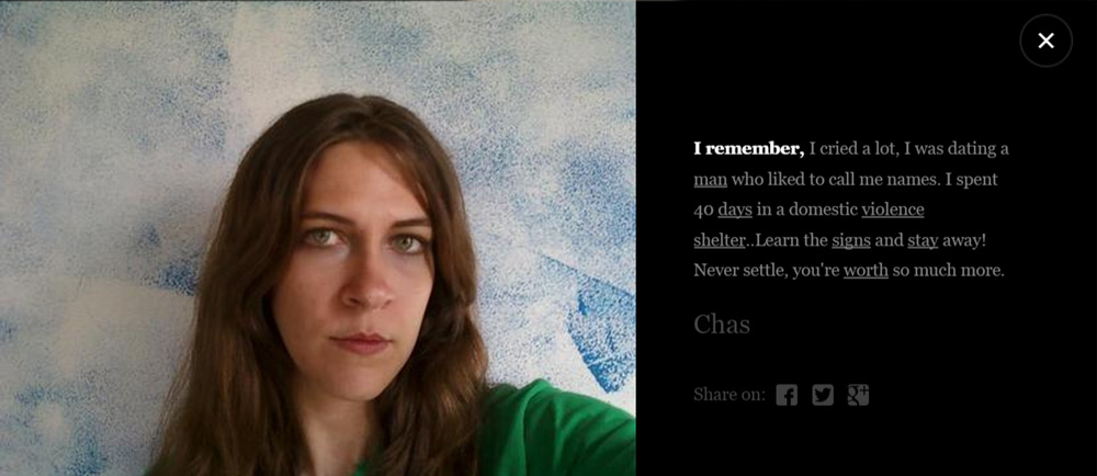
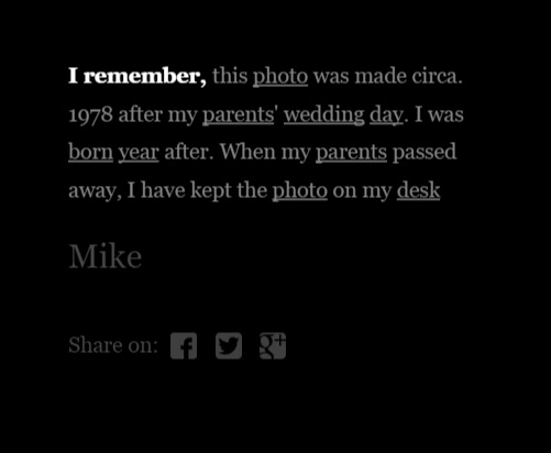
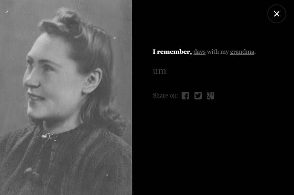
I remember
a digital walk
Art Direction, Design & Motion
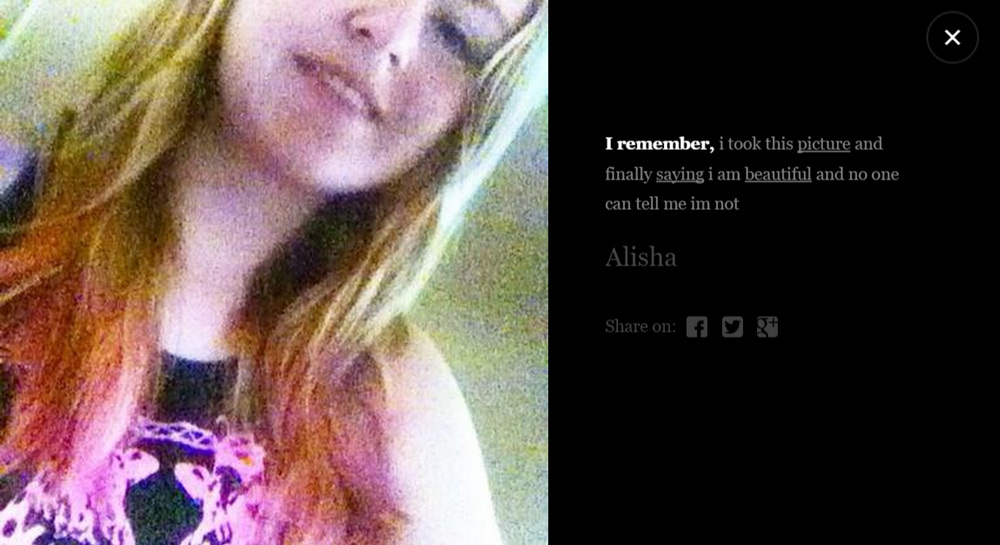
Through this website, we aimed to create a metaphor of the Alzheimer's Disease. The website is reached by a process which destroy the informations through time, as a human brain reached by Alzheimer.
Every user can now be part of the process against the Disease by sharing his most beautifull stories.
To evoke a contemplative walk, we created a universe set into Darkness and Motion. this universe have the form of a gigantic ocean of souvenirs inspirated from Los Angeles from the sky transformed into something organic.
A true technical challenge.
I Remember do not use any 3D modelisation to have the most fluid render possible and display a total of 100.000 particles on the screen. All the effect are created with some GLSL shaders.
Particles are the main graphical part of the website, so we brought a careful consideration about them. A second part of post-processing have been added with an RGB Shift, Tilt Shift, Noise, Color ajustments... We also collaborated with the Xerox reserch center (Grenoble) to automatically tag all the memories from his direct content and link the memories by several main words.
more than 30 000 memories collected
1 500 000€ collected for the reserch against Alzheimer
M
My Most Beautiful Nightmare
Art Direction, Design, Code, Sound, Illustrations, Animations, EVERYTHING!
My most beautiful nightmare is a digital project that invites you to rediscover that dream that until today you simply can't forget.
Trough this piece of digital poetry, I want to sensibilise people about the beauty in their deepest nightmare. They are not an escape, they are the communication between our conscious and unconscious. Dreams are an amazing language to learn that sadly doesn’t exist on duolingo. With the help of a psychoanalyst I put names and meanings on my most relevant dreams and linked them to my awaken situation.
My most beautiful nightmare is a website displaying 5 different artworks. Each of those illustrated frames brings the user in a different world with text, sounds illstrations and animations.
This Idea has been developed and powered by my own skills from the illustrations to the developement. I let you discover all the details from the parallax to the font animations.
The leather-working station shows moments from every step in the creation of a Hermès bag, from leather hide to product. A difficult task was to give people a sense of how the artisan looks at leather, what he or she sees on the skin...
Like a magical lens, the digital pictureframe allows a view of the leather as seen through the eyes of the craftsman. Revealed are the life marks, wrinkles and parts of the leather that are not up to the quality standards of Hermès. Based on this reading and knowledge, the artisan decides how to lay out the pattern, what parts to cut and in which way.
Metal-working for jewellery and watches has an even finer degree of detail. The craftsmen use special magnifying goggles to put the precious pieces together. At Random Studio, we adapted this archetypal piece of equipment for our display: digital binoculars which peer into a museum-grade vitrine, housing the Hermès piece.
Through the goggles, people see the manual fabrication and assembly steps from an artisan’s point of view, at 1-1 scale to make it feel as if you were doing it yourself. A project made with love at Random Studio
T
TeYosh
Art Direction
TeYosh is a duo of Serbian Digital-Artists.
In one year of existance, they have been exhibed in a bunch of galleries across Europe, and published in different magazines.
TeYosh has been mainly recognised for their artwork "Dictionary of Online Behaviour". Now they are also contacted for their uniques and crazy animated visuals.
I had the honour to meet these crazy fellas, help them in their beggining in the artist's world and worked on the creative direction of their website, assuring that it would reflect their personality on their website. I have been working very closely with them to be sure it would reflect the personality of the creative duo.
Between 2 projects I experiement, draw, code, dowload some softwares and try to lead to an output within the time of the trial.
For Where the Road Ends, I gave myself 21 days to design a series of posters made of 3D and code.
You can play with the scenes from your browser, see them moving on your framed, or simply dowload beautiful abstract wallpapers for your phone!
All the posters are getting slowly uploded on my Framed* Artist profile. If you got one of those frames, i'd help you decorate your livingroom ;)
If you don't, you can still dowload them as still images for a beautiful phone wallpaper. A project made with love at Where the Road Ends
Awwwards Conference
Amsterdam 2016 - Conference talk "Make internet great again"